Technical Analysis of the CRB Index (the Commodities Complex) by Sid Norris from ElliottWavePlus.com

The weekly chart (below) of the CRB Index (cash) shows my main Elliott wave count and associated Fibonacci price targets, as well as Cycle analysis, utilizing both the Hurst system and a custom 3.5-year model. (Click on the chart to enlarge).
My Current Analysis of the S&P-500 by Sid Norris from ElliottWavePlus.com
From an Elliott Wave perspective, my top two wave counts are shown. The main count is that an incomplete expanding leading diagonal to the downside is underway starting at the September 21 all-time high. The alternate (shown with question marks) is that an intermediate degree (black) wave 5 to the upside commenced at the December 24 low.
See How Elliott Waves Help You Avoid “Getting Married to the Trend”
See How Elliott Waves Help You Avoid “Getting Married to the Trend”
Most investors make the mistake of linearly extrapolating a financial trend into the future, especially at junctures when that trend is near a turn.
In everyday terms, it’s called “getting married to the trend.”
Here’s what Elliott Wave International President Robert Prechter said in his book, Prechter’s Perspective:
Seeking Certainty in Uncertain Times? Draw a Trendline | Learn How
Seeking Certainty in Uncertain Times? Draw a Trendline | Learn How
Trendlines are simple straight lines connecting two price extremes on a chart. When you draw more than one, you create a so-called trend channel and see both the future trend and trend reversals.
Sid’s Elliott Wave Analysis of McEwen Mining Inc. (ticker symbol MUX)
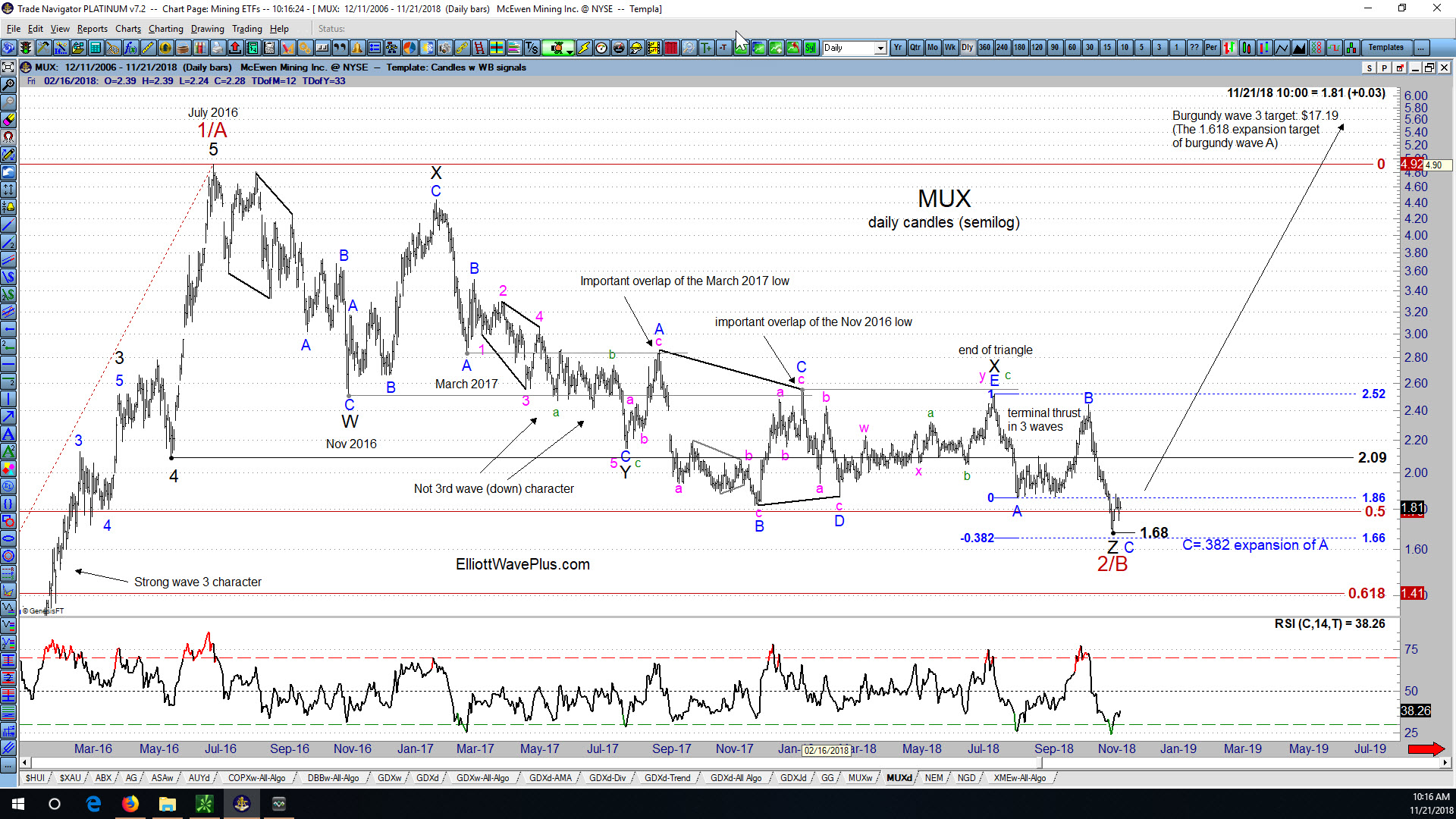
After my recent post on First Majestic Silver Corp. (AG), I’ve received a number of requests for my current wave count on McEwen Mining Inc. (MUX), another highly regarded stock in the precious metals mining sector.
Sid’s Elliott Wave Analysis of First Majestic Silver Corp (ticker symbol AG)
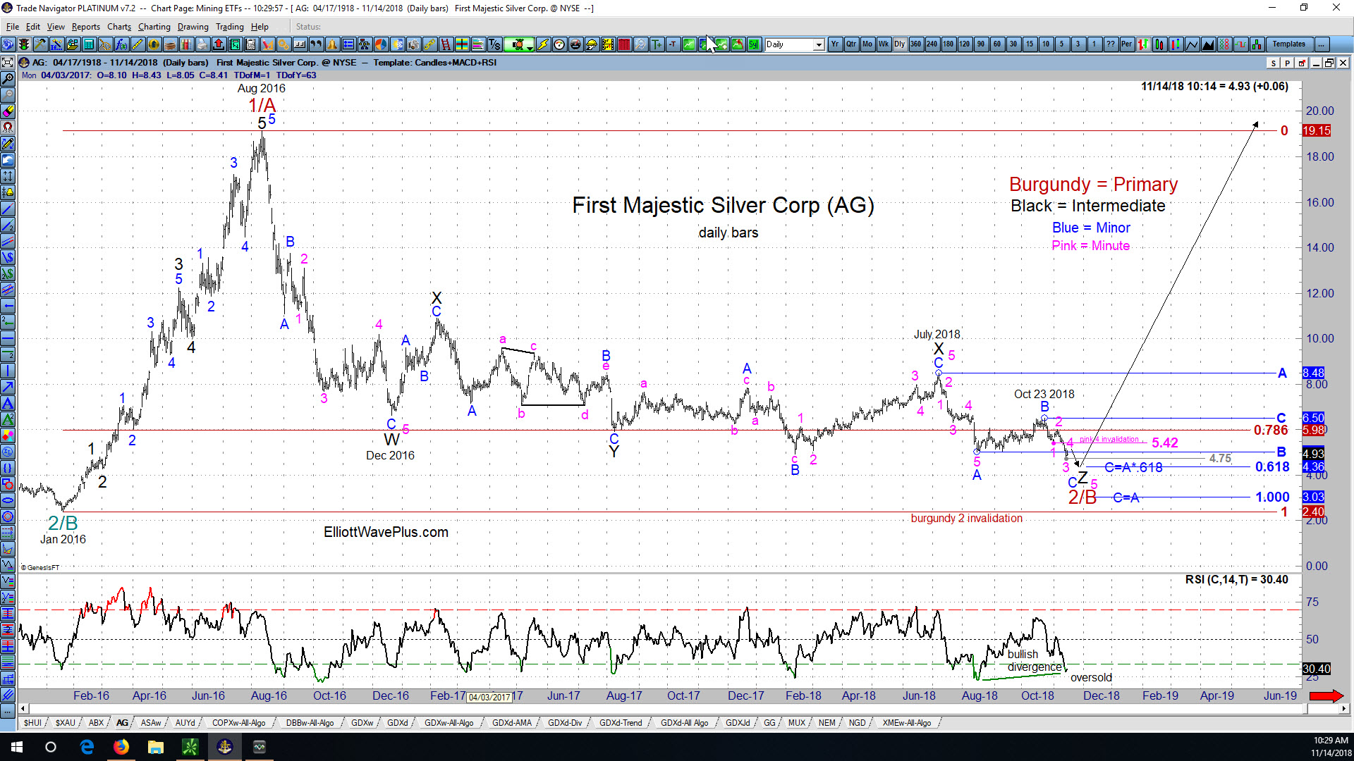
Since AG’s August 2011 high of $26.88, the company’s stock price tumbled all the way down to $2.40 per share in January 2016. Let’s look at the price action in AG starting at that January 2016 low from an Elliott Wave perspective. (Click on the chart to enlarge)
How To Spot Fake Financial News
Wouldn’t it be nice to see a financial news report that simply reported the facts? For instance, the following would be an example of accurate reporting: “The stock market was down X percent today.” But the following is how financial media always reports the news: “The stock market was down X points today on {insert a rationale here}.” Stating ANY REASON for movements in the stock market is more than suspect. It is the perfect example of fake news.
The Chinese Yuan vs Gold. How Correlated Are They?
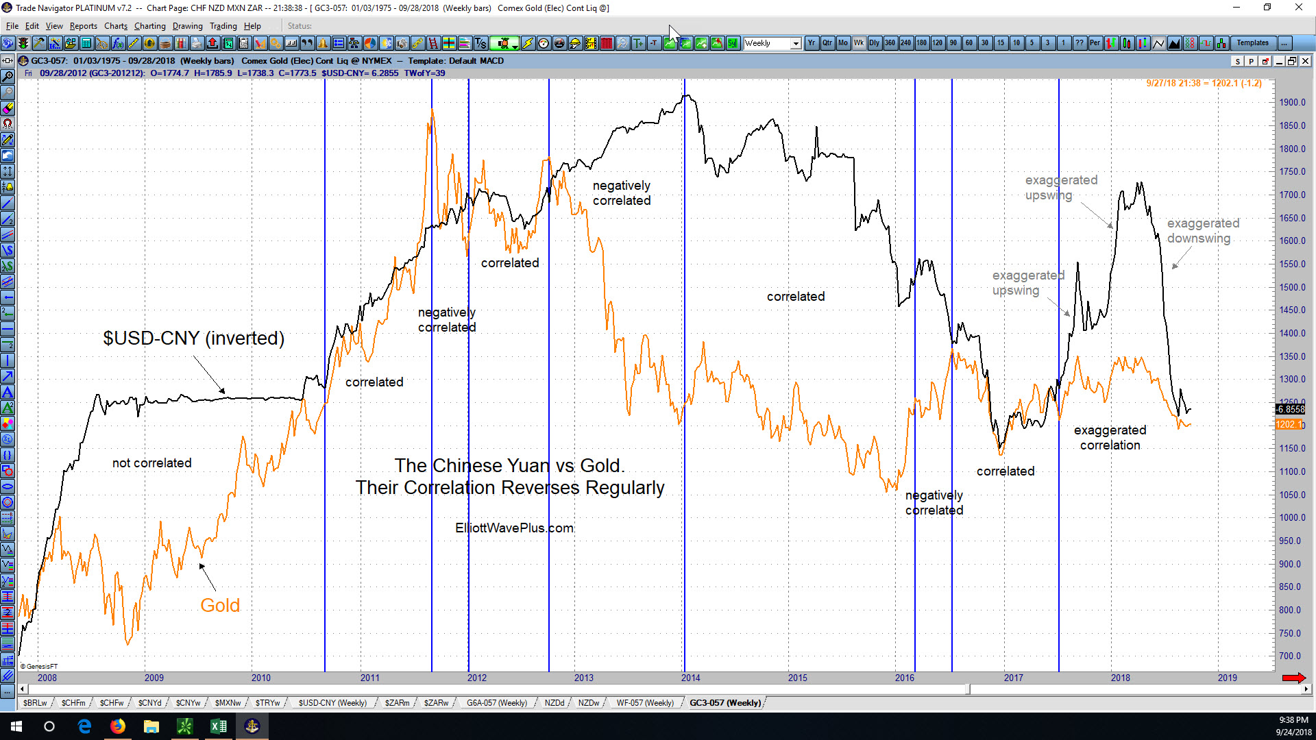
I’ve seen a number of articles lately from various sources stating that essentially the Chinese government is now in full control of the price of Gold. Admittedly, from mid-June through mid-August of this year, the price of gold moved . .
Is Gold’s Historical Correlation with the Australian Dollar and Swiss Franc Predictive?
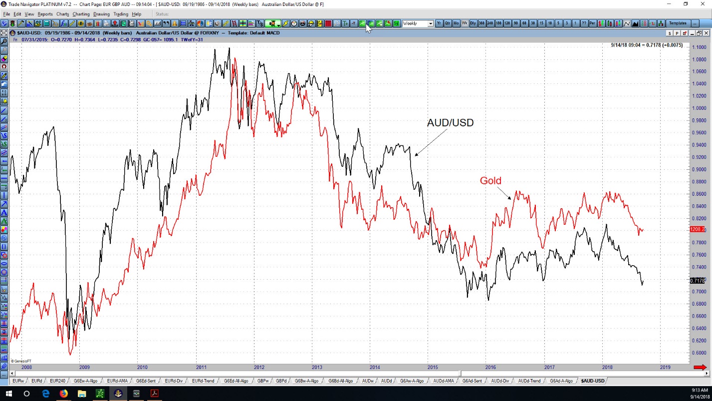
Is Gold’s Historical Correlation with the Australian Dollar and Swiss Franc Predictive? Historical Price movement in Gold is quite similar to price action in the Australian Dollar, especially since late-2008. Gold is also highly correlated with the Swiss Franc, especially since mid-2013. Recently, notice that during Gold’s April-August plunge, the Swiss Franc moved sideways. Then, in mid-August, the Swiss Franc stopped basing and started moving strongly to the upside. Gold has also moved upward since mid-August, although it has lagged the Swiss Franc in aggressiveness. Now let’s look at the AUD/USD currency pair from an Elliott Wave and Hurst Cycles perspective, first on a weekly chart.
A Chartist’s View of New Gold Inc. (ticker NGD)
New Gold Incorporated is a mid-tier gold mining company with mining operations in Canada, the U.S. and Mexico. NGD stock made its all-time low of 74 cents per share in December 2008, and its all-time high of $14.15 per share in September 2011. New Gold is one of the holdings in the two most popular gold mining ETF’s, GDX and GDXJ. Its annual revenue is currently about $725 million. Let’s examine a chart of NGD starting at the 2011 high from a technical point of view.